About the project
Impact
Increased new users by 6000%
Established consistent branding, including Voice and Tone
Average engagement time per session up 152%
Improved SEO with updated and more in-depth website content
The digital presence of a Baltimore city gem, the H.P. Rawlings Conservatory in Baltimore City was in need of rejuvenation due to various challenges it faced.
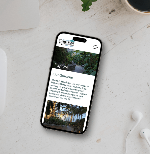
The website suffered from broken links, pixelated images, an unresponsive layout, and outdated or missing information, leading to a subpar experience for visitors.
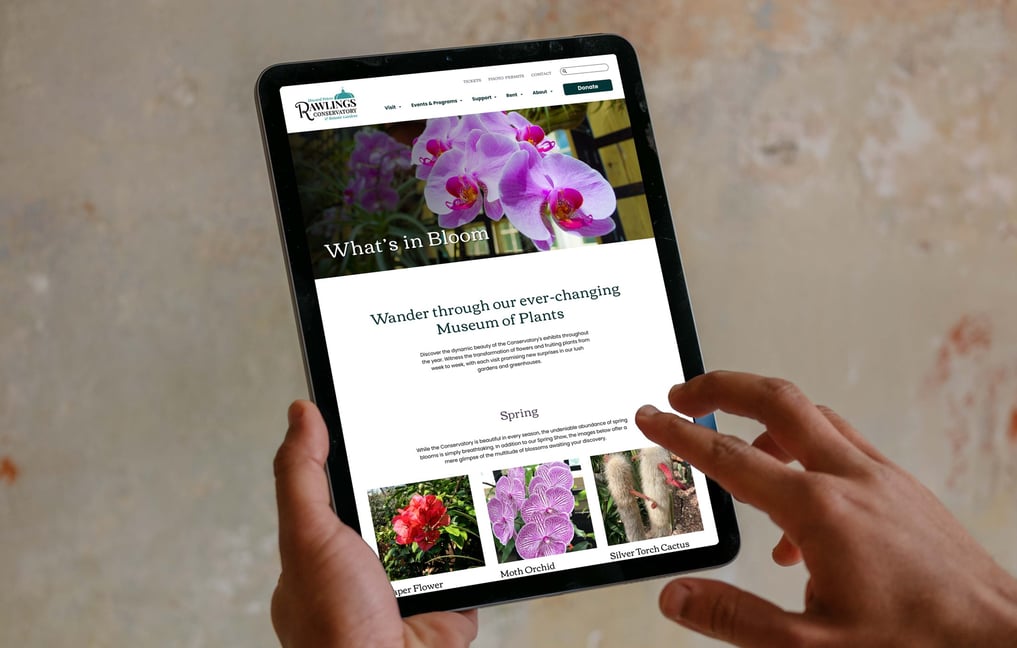
In response, a complete redesign was undertaken to address these issues and create a more user-friendly and visually appealing online platform for the Conservatory.
H.P. Rawlings Conservatory
As a UX team of one, my work focused on seamlessly intertwining user-centric design with the Conservatory's strategic goals to not only address existing issues but to elevate the overall online experience.
UX Research
UX Design
Content Design
Stakeholder Alignment
The initial Client Call and Stakeholder Interviews laid the foundation for a collaborative redesign, where I delved into the Conservatory's ethos to ensure a tailored approach balancing user needs and organizational goals.
Continued collaboration through:
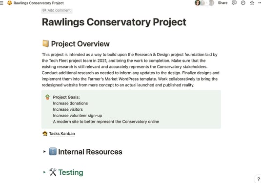
Central Repository
Updates, collaboration, and feedback on Notion
Keeping communication open and the feedback cycle fresh
Weekly progress correspondence
Bi-weekly meetings
Face-to-face collaboration, alignment, and feedback
Reviewing previous Research & Design Artifacts
Research
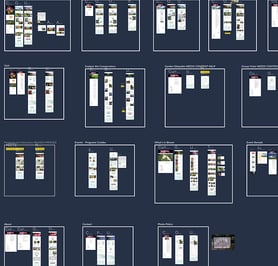
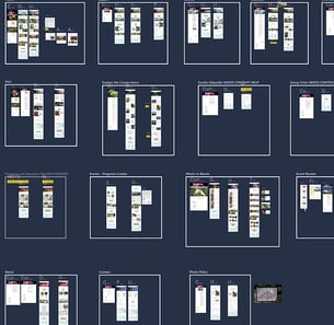
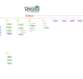
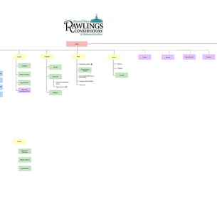
Information Architecture
Design
What was done and learned?
What is still relevant?
Does content support the current map?
Is this what a visitor would expect?
Does the current design visually represent the Conservatory?
Creating a stonger visual identity

Poppins
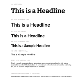
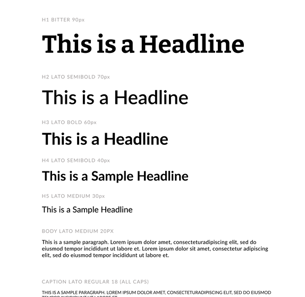
New typefaces and improved type scale for better visual hierarchy
Previous Favicon
Updated Favicon


Improved color palette to compliment, not compete *required color
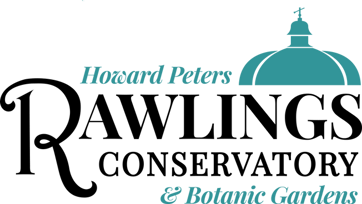
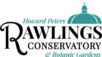
Previous Logo
Updated Logo
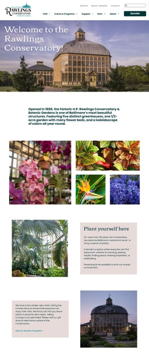
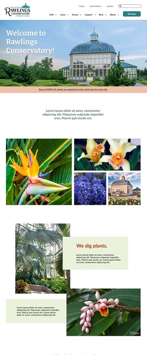
Updating designs
Previous live site
Previous designs using the chosen Divi theme
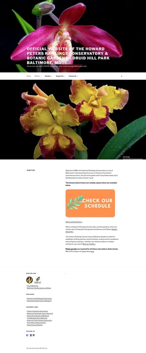
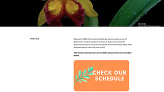
Updated designs


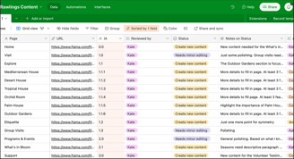
Content Audit
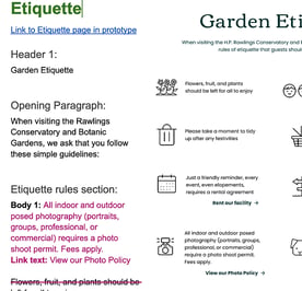
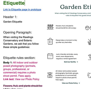
A critical phase in the redesign process involved conducting a Content Audit. This involved a comprehensive review of the existing content landscape, identifying gaps, redundancies, and areas for improvement.

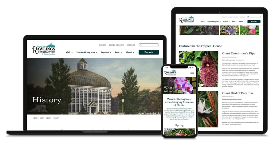
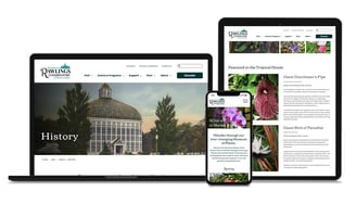
In total, 8 new pages were added to create a richer experience for visitors. These included individual house pages and a dedicated history page, all optimized for different screen sizes.
Designing Better Solutions
A focused Competitive Analysis not only gained insights into industry trends but also sought solutions to save Conservatory staff time.
By implementing evergreen content strategies, I aimed to reduce the need for constant updates, while also providing visitors with a rich experience.

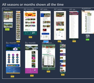
Alternatives to constantly updating plants in bloom
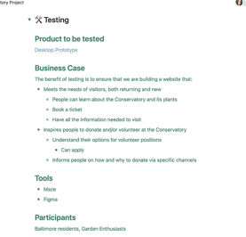
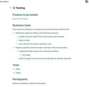
User Testing
Focused on Project Goals
Increasing visitors
Success!
Increasing donations
While the Conservatory might be lucky to have two amazing organizations supporting them, this isn't very clear for potential donors.
Increasing volunteer sign-ups
Success!
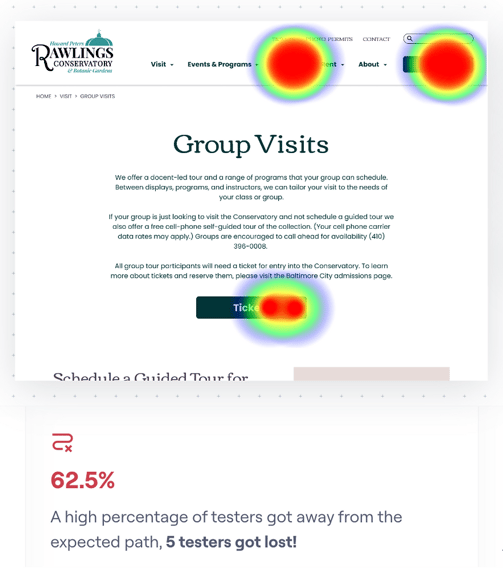

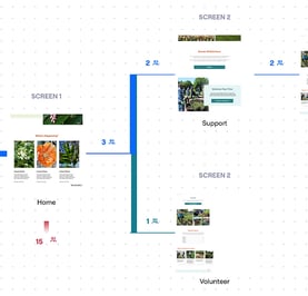
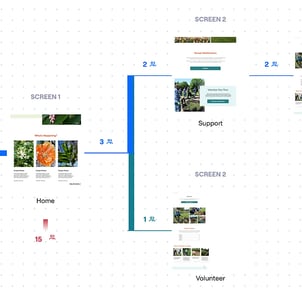
Donation Flow Improvements
Informed by Stakeholders that both organizations have equal importance, it was vital to be diplomatic here.
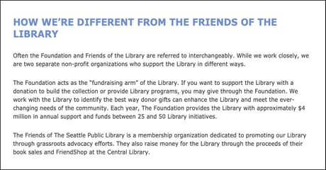

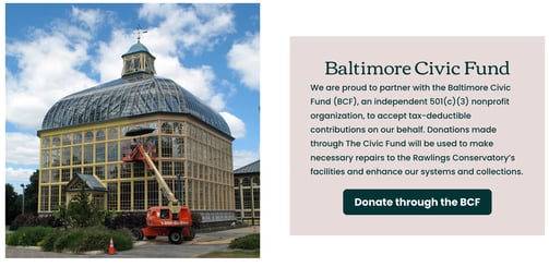

How other organizations handle multiple channels of support
Better explanation of each organization’s impact
Development
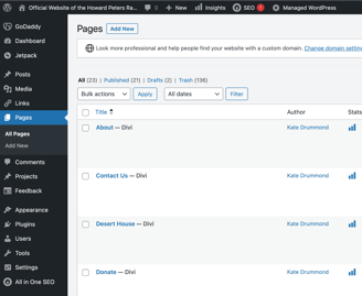
WordPress Implementation
Navigating from design to development, the project transitioned to the WordPress platform—the Conservatory's preferred choice.
Design System
I introduced a comprehensive design system for WordPress, empowering the Conservatory with reusable components for seamless future updates.
Custom CSS
While WordPress provides a lot of customization, additional CSS styling was necessary to achieve the perfect design.

"The new site has turned out even better than I could have imagined. Beautifully designed, easy to use and to find information, it's an extraordinary leap from the previous site and one that we definitely need in terms of timing for a fundraising effort."
- Dave, Conservatory Stakeholder
Next steps
After launching the new website, a comprehensive plan for live user testing was implemented to measure its effectiveness. The redesign significantly expanded the site, adding more topically focused pages for Google to crawl and capture. The content received a complete overhaul, resulting in updated and more in-depth material that improved SEO and kept visitors engaged on each page for longer. Essential website elements were also improved, such as each page's title, tagline, and meta descriptions.
Post-launch Metrics:
6000% increase in new users
Consistent daily visitors since the initial jump
Average engagement time per session up 152%
